Friday 8th August’s fall of 74 points took the ASX200 back to a level that it was at some 9½ months ago. One could argue that the Australian bourse has marked time over this period. However no market marks time, it is always moving and in so doing provides invaluable information that provides clues on where it may be headed.
ASX200 Chart
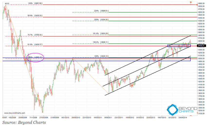
The ASX200 weekly chart below provides investors with a big picture view of where the ASX200 has been and where it may go.
Some explanations first. Believe it or not, I have tried to minimise the number of squiggles and lines on the chart below but bear with me as I clarify what role they play in the analysis below.
Technical analysis can assist with many things, one of which is to attempt to provide order around the movement of financial market prices and values.
I have used three technical analysis techniques in the chart below:
- Parallel trend lines to create a channel and a median line, the rising black lines.
- Support and resistance, the horizontal blue zones.
- Fibonacci retracement and projection, the red and green horizontal lines.
The rising channel, the black lines, shows that the ASX200 is in an up-trend which started in May 2012.
In October 2013, which is around the leftmost area of the upper blue horizontal rectangle, there would have been sufficient data to create this channel. At that time the ASX200 had risen to the top of the channel which typically indicates that prices may retrace either to the median line or all the way to the bottom of the channel. Alternatively, prices could bob along below the upper channel line.
In this case the ASX200 retraced to the median line of the channel and has continued to bob along just above the median line.
This slightly rising price action has resulted in resistance being encountered at the 5420 to 5440 zone from October 2013 to April 2014. The ASX200 then rose above this blue horizontal zone and has retraced back down to it and it has now become a short-term support zone. This is where the ASX200 is right now, smack in the middle of this support zone, which now coincides with the median line of the rising channel.
Before moving onto the Fibonacci levels I should mention the lower blue rectangle which forms a very strong support zone between 4900 and 5000. This will become the next lower support zone should the ASX200 fall below the upper support zone.
The lower support zone coincides with another strong support and resistance area, the 50% Fibonacci retracement level. This is the 50% upward retracement of the 2008 bear market decline and is marked on the chart by the magenta ellipse on the left and the solid red horizontal line going through the middle of the blue horizontal support rectangle.
The upper blue support zone coincides with the 61.8% Fibonacci retracement level at 5426 which is the red horizontal line that goes through the middle of the upper blue support rectangle. This is a 61.8% upward retracement of the 2008 bear market decline.
The upper blue support zone also coincides with the 138.2% Fibonacci projection, the green line just above the upper blue rectangle. A projection occurs when a full 100% retracement of a previous decline has occurred. The decline used on this chart is the 1260 point fall from 5025 in April 2010 to 3765 in August 2011. A 138.2% projection means that the full decline has been clawed back plus a further 38.2%, that is, 3765 + 1260 * 1.382 = 5506.
ASX200 prospects
Let’s turn to where the ASX200 may go. From the analysis shown on the chart, and much other analysis, I have formed the view that the probabilities lie in favour of the ASX200 rising rather than falling.
This article focuses more on the rising case and therefore in the above chart I have removed most of the analysis that deals with a falling ASX200. Except for the lower support zone and lower black channel line which I have discussed above. Of course, if the ASX200 fell to that support zone then further analysis would be conducted at that point.
Back to the rising scenario. This is where the combination of Fibonacci retracement and projection can be used. Firstly, to back the case for a rising ASX200, from here I would expect support to hold around Friday’s close or maybe slightly lower down to 5370.
From these levels I would expect the ASX200 to rise to the 5755 to 5805 zone which is the next set of red and green horizontal lines above the current level. This zone coincides with the end of the upper black line of the rising channel.
If the up-trend continues thereafter, the ASX200 should march onto the 6050 level where some weak resistance should be encountered before rising to the 6285 to 6425 zone, the next higher set of green and red lines. This rise will not be in a straight line. How long it takes will depend on the gradient at which the ASX200 continues to rise and what shape the rise takes.
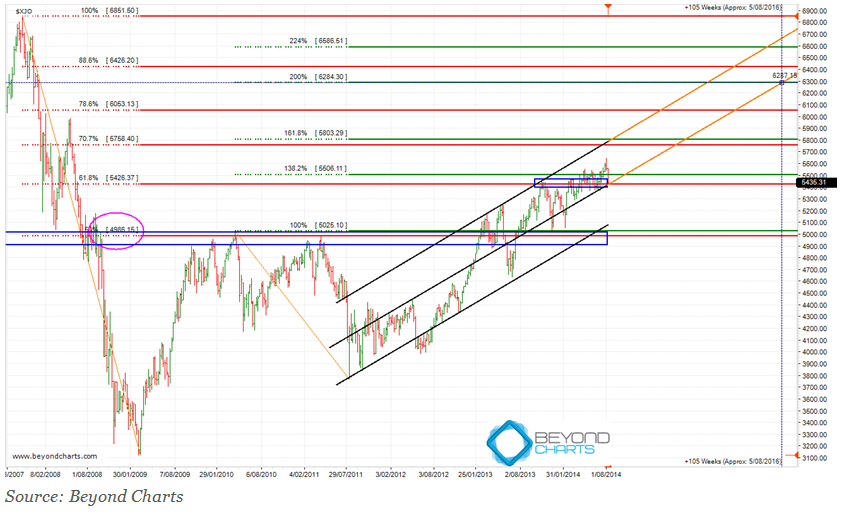
To give us some insight the chart below extends the upper and median channel lines at the same gradient, shown by the orange extended lines. This is a huge assumption and should only be used as an indicative estimate based on this assumption. The extended median trend line estimates that 6285 could be reached by August 2016, at this gradient of rising, indicated by the vertical dotted line at the right side of the chart.
If the upper trend line is used for the rough estimate the projected date could be September 2015. Of course the gradient could increase or decline changing these estimates by many months.
Gary Stone is the Founder and Managing Director of Share Wealth Systems.


Hi Gary
Thanks for this.
Does your view that the probabilities lie in favour of the ASX200 rising rather than falling from here
not contradict the recent High Market Risk signal on GPS?
Regards
David
Response to Comment by David:
The market is full of contradictions and paradoxes. And the permutations of how price action will unfold in the short, medium and long term is infinite. Which is why I use mechanical systems as my decision support systems.
For my medium term trading, I follow the multiple 1000’s of hours of in-depth research that I have conducted over the years to follow the mechanical rules that have resulted from that research. And as such I have ceased taking new positions this week precisely according to those SPA3 rules.
I do this because I subscribe to the market truth that you “do not need to know what happens next in order to make money in the market.” This is one of Mark Douglas’s Five Fundamental Truths which should all be taken in context together. This statement is only a truth if you have an edge.
Also, “anything can happen”, another fundamental truth from Mark Douglas – read his book “Trading in the Zone” for the other three and why they are so important to become a consistently successful trader.
Hence I have followed the High Market Risk signal and acted according to my Trading Plan.
However, the market operates in many timeframes. And there are many many techniques that can be used to analyse the market. The techniques that I used in the article above, written for a third party newsletter, are different to the techniques that SPA3 uses.
All that both SPA3 and the analysis above offers are probabilities, not certainty. In this particular instance they could both be correct, they could both be incorrect and everything inbetween. But certainty can be achieved over a large sample by executing according to the probabilities of the edge and allowing the Law of Large Numbers to play its role and take effect.
The most important thing therefore is not what will happen from here but what one will do when it happens.
Regards
Gary