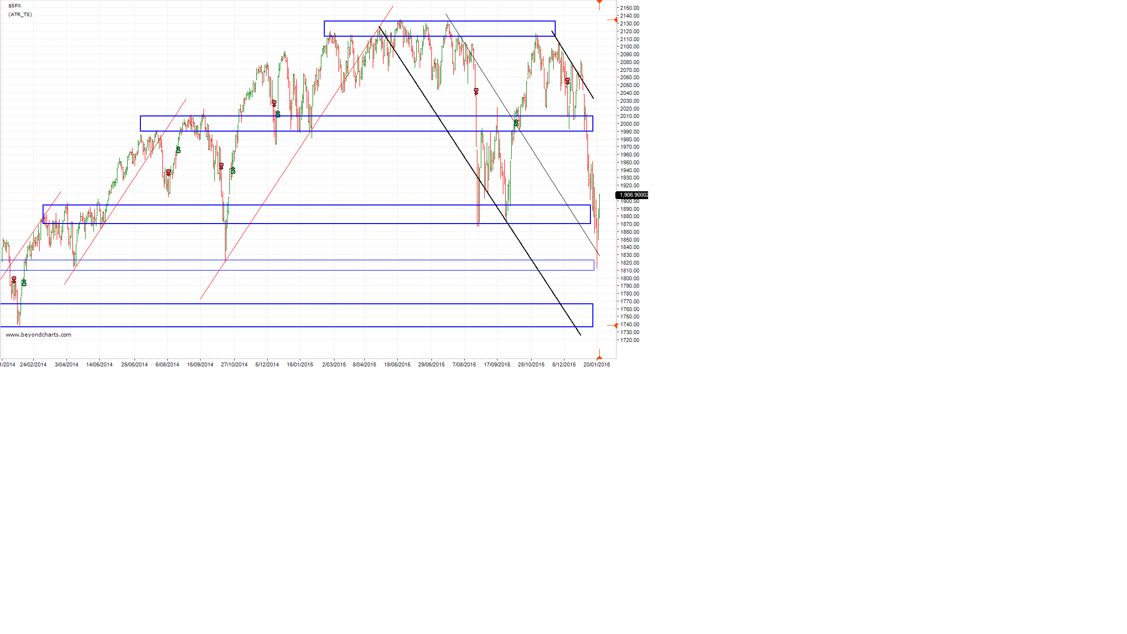
This two year chart of the S&P500 shows a down trending channel demarcated with black trend lines. The middle thinner black line is the median line of the channel where the S&P500 found support in the middle of last week. The gradient of the down trending channel is an inversion of the up-trend red lines.
The horizontal blue support and resistance zones show price levels where the S&P500 has reversed in the past, both up and down. The second from bottom support zone provided support on Wednesday last week between 1801 and 1825 that coincides with the median line of the down channel.
Support held at the middle horizontal support zone in August last year between 1870 and 1895 when the S&P500 last fell sharply, however not this time around. Given that support did not hold at 1870 to 1895 zone it is likely that the S&P500 will retest the support zone between 1801 and 1825 and then move down to test the next support zone between 1735 and 1765, the bottom blue horizontal zone on the chart.
The 1735 to 1765 zone roughly coincides with the lower black down trending channel line. If the S&P500 makes it down to this support zone this will complete a 38.2% retracement of the 1060 point run-up from October 2011 to May 2015 when the SP&500 all-time high of 2134 was reached.
Source: Beyond Charts
The middle support zone on the chart where the S&P500 closed on Friday is a 23.6% retracement of that same 1060 point run-up. Whilst such a shallow retracement is common in secular bull markets a 38.2% retracement is healthy from time to time to set up for the next primary bull market.
To arrest this down trend in the first instance support will need to be found at one of the horizontal blue support zones. Then the S&P500 will need to break above the upper down trending black channel line. That appears to be some weeks, maybe months, away.
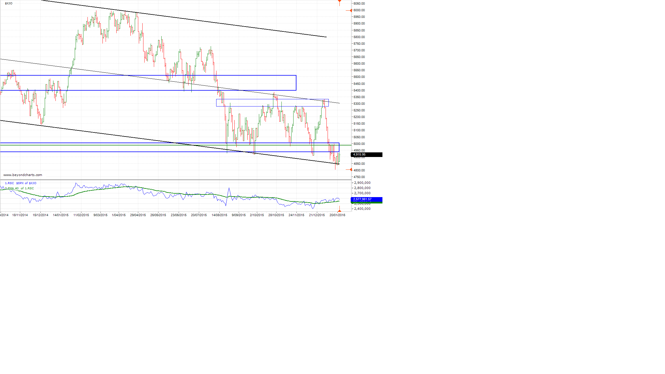
To provide continuity of commentary on the Australian market in these troubling times I have included a chart this week on the ASX200 to continue from the commentary of two weeks ago where I posed the question whether the ASX200 would hold support.
Source: Beyond Charts
The lower graph of the ASX200 chart shows blue and green lines which compares the movement of the two indices, the S&P500 and the ASX200.
Over the last five weeks the ASX200 has outperformed the S&P500. This can be seen in the bottom right corner where the blue line, which also has an overlayed green moving average, both of which have started rising indicating the ASX200’s outperformance of the S&P500. This happened last year too between November 2014 and February 2015 before the ASX200 spent the next 9 months underperforming the S&P500.
The ASX200 has closed below its major support zone between 4920 and 5000 seven times, around the limit for my subjective count of a support zone ‘holding’. It did indeed fall to the lower channel line where it appears to have found support for the time being.
It will be interesting to see if the support in this area can continue to hold for the ASX200 and it continue to outperform the S&P500 if the S&P500 falls around 150 points to that bottom support zone around 1735 to 1765.
Gary Stone is the Founder and Managing Director of Share Wealth Systems.

So will we trade too 5300,5400 then sell off thats what the market is saying??????
John,
It depends what you investing horizon is; short, medium or long term.
5300 to 5400 is certainly where the immediate resistance is. But there’s no guarantee that the market will get there. And if it does it may go shooting through.
Regards
Gary