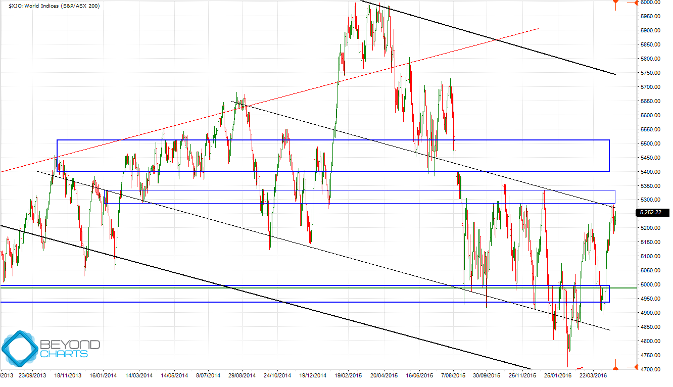
Whilst the chart of the ASX200 shows that a technical resistance zone has been reached there may be more good news that stalks behind the scenes and that belies the current poor economic news of a waning China that fills the airwaves.
But first to the chart of the ASX200. In January and March I asked the question whether the major support zone of 4925 to 5000 (bottom blue horizontal zone) on the ASX200 would hold. It certainly has; for the time being.
The question now is whether the overhead resistance zone of 5285 to 5330, which is a relatively weaker zone (shown by the middle blue horizontal zone), will continue to be resistance, or whether the ASX200 will break through it and take on the stronger overhead resistance zone of 5400 to 5500 (the top blue zone)? With the backdrop of “sell in May and go away” hanging over our heads like the sword of Damocles does at this time every year.
Source: Beyond Charts
Technically there is a higher probability of a short to medium term retracement from the current level of 5250 back down to retest the strong support zone of 4950 to 5000. The evidence that supports this are the weaker resistance zone already mentioned and the down slanting black trend line where the current price is. This trend line is a ‘median’ line in the down trending channel that is depicted by the thicker black down trending upper and lower channel lines. These channel lines are ‘in control’ until the ASX200 breaks above the upper channel line which is currently around 5700.
This short to medium term analysis does support the dooms-dayers who have been running rampant over the last few months. However, what good news stalks these dooms-dayers? It is rising commodity prices. Take a look at these. Since January, when the sky was about to fall on our heads if you were to believe the mainstream financial media with the worst stock market start to a calendar year for decades and all the negative connotations to go with that:
- Iron ore is up 75%,
- Oil is up 75%,
- Nickel is up 22%,
- Zinc is up 31%,
- Copper is up 17%,
- Lead is up 12%,
- Palladium is up 27%,
- Gold is up 23%,
- Silver is up 30%, and
- Platinum is up 31%.
All of these, even the precious metals though to a lesser degree, are used in industry. Of these, Palladium, Nickel, Zinc, Iron ore, Oil, Platinum, Gold and Silver have all achieved technical breakouts and higher high close prices indicating short to medium term up trends are well and truly in place.
This could be a commodities technical rally on the world’s futures markets but it could also be a long awaited turn in the commodity cycle. If it is the latter then this could be the early signs of unanticipated increased demand which should bode well for the Australian stock market, being perceived around the world as a ‘resources economy’. Since the January low, other ‘resource economies’ such as the Canadian TSX index is up 18%, the Dow Jones South Africa ZADOW index is up 21.5% and the Brazilian Bovespa index is up 43% (yes, despite all its woes!). The ASX200 is up just 10%.
Stock-wise, since the January low, BHP is up 45%, RIO is up 28% and NCM (Newcrest) is up 70%. I won’t list the small to medium cap Australian resource stocks that are enjoying their best period in years as room doesn’t permit in this article! A bell weather large cap resources stock that I follow in the USA, Freeport-McMoRan (FCX), is up 274% since January.
How will we know which will win out between the gloom-and-doomers and a possible commodity-led stock market rally? By keeping a watchful eye on the price movement of commodities, the ASX200, certain sector indices and individual stocks. If you don’t do that anywhere else we’ll do it here for you.
Gary Stone is the Founder and Managing Director of Share Wealth Systems.


very interesting and helpful analysis
thank you Gary
A watchful eye and updates from you is greatly appreciated