An often overlooked technique by many traders, investors, and unfortunately even some investment professionals is that of charting the equity changes that occurs in a portfolio. Most tend to review the net changes that occur in a list but few go to the trouble of reviewing a mark to market equity curve of the portfolios daily results.
What is a mark to market equity curve?
A mark to market equity curve is produced with the use of a mathematical calculation to track (typically daily) the current market value of assets held in securities and / or cash. Mark to market equity analysis plots the current market value of assets and reflects how much such assets would be sold for if they were sold on the market today. Essentially a mark to market equity curve plots both the closed trade profits/losses and the currently open trade profit /losses, that is, the unrealised profits/losses.
The major benefits of tracking the performance of assets on a mark to market basis are two fold:
- You can visually see the historical up, down or sideways trends that occur in your portfolio.
- You can compare and measure the portfolios performance to a benchmark.
Visually reviewing the performance of your portfolio
Producing and then reviewing your mark to market equity curve will provide you with a wealth of information. It will graphically depict when your trading approach is either in sync or out of sync with the market and you can adjust your style and risk profile based on the performance. You will visually start to notice trends in your trading that you won’t otherwise see from analysing statistics.
With this visual view you may wish to apply technical analysis techniques to your equity curve to minimise drawdown at times when your trading approach is out of sync with the market that you are trading. If you use such a technique you will also need to devise a way to continue your equity curve while you are not trading and then also a technique to resume trading.
Trading and investing needs to be measured
So, how can you measure the performance of your investing activities? How do you know that you’re achieving an above average return on your capital and a reward that is appropriate for the time and effort you’re putting into your investing activities?
For those trading stocks on the ASX, one such measure is the All Ordinaries Accumulation Index. While the typical fund and investment manager use the ASX200 or ASX300 as a bench-mark, the All Ordinaries Accumulation Index measures the All Ordinaries Index but assumes that all dividends are reinvested. That means that every time a company in the ASX500 index pays a dividend to its shareholders, the Accumulation Index assumes that these dividends are then re-invested back into more shares in the company. The Accumulation index will therefore have a higher value and a higher percentage return than the standard All Ordinaries Index. Alternatively the ASX200 or ASX300 Accumulation Indices could be used.
Measuring portfolio performance with the use of a mark to market equity curve, to that of the Accumulation Index, provides a visual measure of your investing performance relative to a benchmark. It allows you to measure not only the financial loss or gain of your investments on an objective basis but also the reward to effort and time it takes to run your very own investment portfolio. The benchmark provides an insight into what the investing environment has on offer and then how you have measured up against what has been on offer.
Once you collate the data and measure portfolio performance to a relative bench mark, you may be shocked to learn of your performance. If this is the case, you can then consider what you may do about it.
I have had many instances in the past where investors have been ecstatic about hearing from their financial advisor that their investments attained a 15% or 20% return in any given year be very disappointed when I have put their returns into perspective over a longer term and benchmarked against an Accumulation Index in CAGR (Compounded Annual Growth Return).
As a stock market R & D business, we continually research our trading systems for the benefit of our clients. Our research begins at the statistical level but the real proof lies in equity curve analysis. A mark to market equity curve will provide you with an understanding of how your strategy actually trades through various market conditions and how you measure up relative to an Index bench mark.
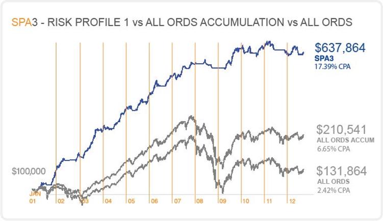
The above equity curve compares the Share Wealth Systems Public Portfolio: SPA3 Portfolio – Risk Profile 1 against both the All-Ords Accumulation and All-Ords from the 25th January 2001 to 14th August 2012.
The performance of the SPA3 public portfolio has been achieved by strictly adhering to the SPA3 rules and processes. Portfolio returns will differ when taking into account portfolio size, trade selection and the time the portfolio began. Past performance is no guarantee of future performance. Trades are committed to the portfolio in real-time and include costs associated with trading but are not executed in the market.


how do you produce this type of chart?
Hi Andrew,
Great question as this was not covered in Gary’s Journal Post.
Obviously you need portfolio management tools to be able to track your mark to market equity curve. SPA3 customers use a Portfolio Management tool called TradeMaster.
We may expand your question in a future journal post.