 | From the Share Wealth Systems R&D Team |
_
Don’t forget to ‘Like’ us on Facebook – Click the ‘Like’ button on the right
Portfolio Exploratory Simulation Results
In the final post of the ‘New groundbreaking Research’ series, I’m going to share with you the actual simulated performance results from the recent SPA3 review. That’s right, not with the use of statistics but rather in pictures. Pictures that demonstrate the type of performance that could have been achieved over the past 10 years.
And make no mistake, what you’re about to discover may truly challenge the way you currently invest in the market. If so, don’t be afraid…that’s a good thing. At the end of this process I want you to ask yourself the question: “Is my market strategy good enough to produce this type of result”? If the answer is yes, great. If not, we ask that you consider SPA3 as a tested and live traded system that has been commercially available since 1998.
Each historical portfolio equity curve we are about to reveal, is an unrealised profit equity curve or a mark-to-market equity curve with the portfolio value being recalculated on a daily basis for the life of the portfolio.
The following criteria were used in the exploratory simulation phase to test the performance and compare the Pre December 2011 SPA3 Edge verses SPA3 Revised Edge. In each case, 400 individual portfolios were used to test the variation of portfolio outcomes:
-
-
- ASX only trades from 1/1/2001 to 1/5/2011.
-
-
-
- ASX200 stocks only including all stocks that have been a constituent of the ASX200 over the research period.
-
-
-
- $50K starting capital was used for each simulation.
-
-
-
- A maximum of 5 open positions per portfolio.
-
-
-
- No brokerage was used.
-
-
-
- A Percent Risk position sizing model with position sizes of 2%.
- The Percent Risk refers to how much of total portfolio is risked to lose. That is, a 2% risk per trade is 2% of $50,000 = $1,000.
- Randomly chosen trade selection from available trades whenever there was a vacant position in the portfolio to be filled.
- This means that on any given day where there was more than one SPA3 trade available to select from, the trade was chosen on a purely random basis.
- This is the main difference in the various equity curves shown below because at each decision point when a different trade is selected it will end on a different day to the alternative trades which will take each portfolio down a unique path of trades. Hence the variation in portfolio equity curves because actual trades that were available on that day are used in the historical portfolio construction.
- This is the biggest difference between Exploratory Simulation and Monte Carlo Simulation. Monte Carlo Simulation randomly selects any trade from the entire database of trades which has a very low probability of being near to the type of market, up down or sideways, being experienced at that time.
- New position sizes were not decreased as drawdown started and increased. No pyramiding or lightening was used.
- A Percent Risk position sizing model with position sizes of 2%.
-
-
- Excluding brokerage. Simulations including brokerage are shown later.
The starting position
All trades, all markets – PreDec2011 SPA3 Edge
The following simulation used a position size of 2% risk per trade on the PreDec2011 SPA3 Edge.
The same position size was used for all trades and all trades were taken in all market conditions, i.e. no reduction of position size was used for market risk or sector risk, meaning that all markets, Low Risk and High Risk, were traded with the maximum position size and maximum exposure.
Whilst this is unrealistic, as there are no SPA3 rules that would allow this to occur, we have used it as a starting position for the simulation testing to illustrate the huge difference in outcomes that can occur as compared to the other simulations that follow when altering the trading system and, more importantly, when altering the risk and money management rules.
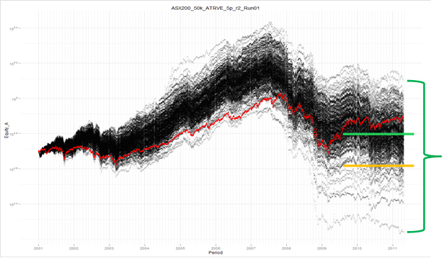
So what can we learn from Chart 1? The red equity curve is the All Ords index. Each black line is a portfolio mark-to-market equity curve generated according to the risk and money management rules by randomly selecting trades from the available trades on that given trading day.
The green line indicates the approximate median (50 percentile where half the portfolios were above and half below the line) return and the orange line indicates the approximate 95 percentile return, i.e. 95% of portfolios were above this line and 5% below it.
Notice the depth of the green band and how the dispersion of portfolios from the best to the worst performer is extremely wide.
Note the following in the chart 1 above:
-
- The wide variation in portfolio outcomes.
- The 50 percentile is below the All Ords which means most portfolios would have underperformed the market.
- The 50 percentile is above the starting position but the 95 percentile is not.
Changes to the rules
Introduce Market Risk – PreDec2011 SPA3 Edge
The following simulation used a position size of 2% risk per trade on the PreDec2011 SPA3 Edge.
In this simulation no new trades were taken during SPA3 High Market Risk periods but trades that were open when the market turned to High Risk were allowed to stay open until an exit signal was triggered in each trade. This is known as Risk Profile 1 where no new trades are taken in a High Market Risk.
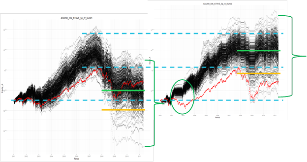
While we’re yet to review the Post December 2011 edge, notice the dramatic difference adding market risk has made to Chart 2’s equity curve. The chart on the left is the same Chart 1 as above in the previous section. With no new trades open in a SPA3 High Market Risk, the equity curve performance is somewhat maintained compared to Chart 1 which felt the full effect of the 2002-2003 bear market and the 2007-2009 Global Financial Crisis.
Note the following in the chart above:
-
- The variation in portfolio outcomes (the green parentheses) is only slightly narrower but much higher up the scale. The idea is to reduce the variation of portfolio outcomes.
- The 50 percentile is way above the All Ords. This shows the importance of risk management with just a single rule change.
- The 50 percentile and the 95 percentile are well above the starting position.
- There are still portfolios that underperformed the All Ords.
Whilst Chart 2 shows the importance of risk management rules, the performance is about to get even better.
The introduction of the SPA3 Revised Edge
Market Risk – SPA3 Revised Edge
The following simulation used a position size of 2% risk per trade on the SPA3 Revised Edge.
The only change between this simulation and the previous simulation were the trades used for the simulation being SPA3 Revised Edge trades.
That is, this simulation did not take any new trades during High Market Risk periods but trades that were currently open when the market turned to High Risk were allowed to run to their respective exit signals.
This is a key simulation as it shows the main benefit of the SPA3 Revised Edge, the much lower variation in portfolio outcomes.
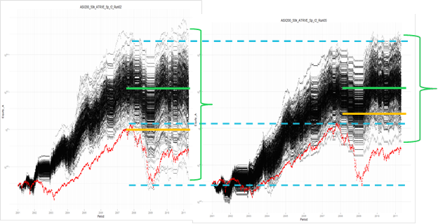
Now we’re getting somewhere! Look at Chart 3 and how the green band has tightened compared to Chart 2.
This clearly display’s the effect that the new Profit Stop and exit rules have had on making the trades similar in characteristic. Also notice how the black equity curves in Chart 3 are more intense. Because the trades are closer in similarity, the portfolio equity curves have come closer together. The large reduction in ETD, higher Win Rate, lower Avg Loss Std Dev and higher SQN have all lead to this outcome.
Note in Chart 3 being the new simulation:
-
- The variation in portfolio outcomes is much narrower but not necessarily higher up the scale. The reduction in the variation of portfolio outcomes is plainly obvious from the green bracket.
- The 50 percentile is way above All Ords but not that different to the previous simulation.
- The 95 percentile is much higher, which is a direct result of the reduction in the variation of outcomes. This is a key statistic.
- All portfolios outperformed the All Ords.
Changes to the rules to improve performance
Different exit rules for Market Risk – SPA3 Revised Edge
The following simulation used a position size of 2% risk per trade on the SPA3 Revised Edge.
The only change between this simulation and the previous simulation was that all trades were exited immediately when the Market Risk turned to high risk, rather than allowing the trades to continue to their exit signal. This was done to research a simple change in a risk management rule. Also, it has been an often asked question about SPA3 over the years whether to exit immediately or to remain in the trade until an exit signal occurs when the market turns to High Risk.
Whilst the outcomes will be different depending on the nature of a particular High Risk Market, there is a definite and noticeable difference over the long term in favour of exiting trades immediately when the High Market Risk occurs.
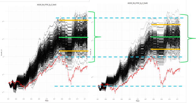
The High Market Risk rule changes applied to Chart 4 have improved the performance once again. The green band has brought the portfolio variations even closer together. Remember, this is 10 years of portfolio history and approximately 500 odd trades per portfolio. An out-performance of the All Ords was achieved by 100% of the 400 portfolios run in Chart 4.
Note the following in the chart above:
-
- The variation in portfolio outcomes is slightly narrower but not necessarily higher up the scale.
- The 50 percentile is very similar to the previous simulation.
- The 95 percentile is also very similar to the previous simulation but has risen more than the 50 percentile.
- All portfolios outperformed the All Ords and the new simulation’s worst portfolio is higher than the previous simulation.
- The 5 percentile (upper orange lines) is a bit lower on the new simulation meaning that the previous simulation could perform better whilst also taking the risk of performing worse. The idea of this research is to narrow the variation of portfolio outcomes.
- The simulation in Chart 4 performed better during the 2002 bear market and there is more ‘white space’ between the All Ords and the lower portfolio equity curves.
Exploratory simulation does not forecast returns, nothing can. It forecasts strategy or policy given different market conditions in the future. It stress tests different rules in severe conditions with historical data to determine how the rules might hold up if the severe conditions might occur again in the future.
In conclusion
I started out writing this series of blog articles making some very big promises. I hope that what I’ve shared with you fulfils each and every one of them.
The articles are just a snippet of a “White Paper” that I wrote on the entire research project. If you have a technical bend and would like to read the research from front to back, I am happy to make it available to you at the following link. SPECIAL REPORT – SPA3 Revised Edge White Paper
Why is this information so important? It takes active investment to the mandatory level of understanding and preparation and one which is rarely covered by retail investors or their service providers.
If you’re investing with the help of a tip sheet, broker, newsletter or market expert, I challenge you to ask yourself, “Is my market strategy robust and rigorous enough to continue to repeatedly produce results that will outperform the market”? I can confidently say that the majority of the experts wouldn’t know if they had an Edge, let alone what risk and money management rules may affect their potential outcomes in the future. If you have come to this conclusion yourself, the question must be why are you still persisting with them?
If you‘re a serious investor who looks to the market as a means to grow your capital, I’d encourage you to register for a demonstration of SPA3 where we can demonstrate the development that has been poured into the methodology since 1998. You can register for a demonstration here.
After all, this is the primary reason investors choose to support our business. They trust that we will continue to improve the performance of our systems which has a direct effect on their success in the market.
In the near future we will discuss and demonstrate how risk and money management can further improve SPA3’s portfolio simulation results. This research is a continuation of SPA3’s evolution, and we look forward to sharing our findings with our followers.
Thank you for your time and I wish you a successful and profitable active investment.

