The S&P500 is currently enjoying a short and medium term up trend and is shaping up to make another attempt at achieving a new all-time high.
This current medium-term uptrend was first confirmed on 19th October after the S&P500 rose above the top downward slanting black trend line and then formed a short-term trough above that same trend line. This occurred just after the most recent green alert icon on the chart.
Since then the S&P rose to test the top resistance zone, the seventh attempt to beach this area, and yet another attempt to initiate a trend above the current all-time high of 2134.72, some 44.6 points or 2.13% away from the current level of 2090.11.
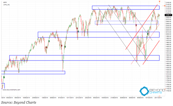
The upward slanting red trend lines form a channel that is exactly the same gradient, but inverted, as the downward slanting channel marked by the black trend lines. Each channel is formed by the two outer trend lines, respectively, and the trend line in between each channel is the ‘median line’. Each trend line is drawn to touch peaks and troughs which form support and resistance points joined together by the trend lines.
The support and resistance zones shown on the chart with blue elongated rectangles are formed where price has previously formed peaks and troughs. After more than 25 years, when I first started learning this stuff, it still amazes me how often price movement, even with indices which are the amalgamation of many stocks’ prices, form support and resistance zones from peaks and troughs that repeat at or near similar levels.
Jointly these charting tools can assist in determining what the probability is of prices maintaining their current direction or not, and what the trigger points are for the probability improving or worsening.
These zones show that there is currently support between 2045 to 2060 below, and resistance between 2115 to 2134 above. The upward slanting red median line coincides with the lower support zone. The upper red channel line coincides with the upper resistance zone. A breach in either of the channel trend lines together with the respective support and resistance zones will indicate what the probability is of an advance to above the previous all-time high or a fall to the next support zone below between 1980 and 2000.
To get off the fence my technical view is that there is a higher probability of the S&P500 advancing from here than of falling. Added to the above analysis, the double bottom ‘W’ that formed in August and September and the fact that the trend is up are key factors in this call. Until there is evidence that the trend has reversed one should continue to go with the current trend.
Depicting price movement in terms of channels, trend lines and support and resistance zones helps an investor put some order into what may appear to be random chaos to the unlearned and naked eye. Of course these are not the only price charting analysis tools available to an analyst but they are probably the simplest that one can use to form a picture to get perspective on current and near future movement of financial market prices. I will use others when the simple techniques used here don’t paint such a clear picture.