Gary’s Comments
Equity markets have experienced some very volatile price action in the last month or so. To put it into perspective, equity indices on the US markets have reached similar volatility levels in August / September 2011 to those experienced on only a few preceding occasions: in March 2009, July 2002, October 1974, June 1970, June 1962 and on 6 occasions between Oct 1931 and July 1933. All of these were at or near market bottoms. October 2008 through to December 2008 experienced even higher volatility and was not quite the market bottom (that followed 3 months later) as did October 1987 which was a market bottom. And lastly, October – November 1929 also experienced volatility at similar levels to 1987 and 2008 and was a market bottom by mid November 1929, but only for five months.
Now I am not calling a market bottom but history shows that extremely high volatility does typically precede contracting volatility and a rising market. The big question is, how long does the ensuing rising market last? History shows anywhere between a month and 10 months with all sorts of varying strengths. The point is that we can expect volatility to contract somewhat. However, if the support zones that are discussed below do not hold then we can expect volatility to rise once again.
The Active Investor tables below do not paint a pretty picture for long only equity investors. This is why having a timing mechanism to reduce exposure either totally or partially or to hedge is absolutely necessary in this day and age.
The important support zones to watch in the near term are as follows: DJIA 10725 – 10860 then a strong support zone between 10310 – 10435; S&P500 1150 and then 1100 – 1115; Nasdaq Composite 2550 (very close support line because the Nasdaq has risen by more than other indices) and then a strong support zone at 2240 – 2300; All ORDS 4100 – 4230.
Asian and European equity indices are looking rather weak at the moment and are mostly positioned just above important supports zones except the DAX which actually fell below it’s major support zone (which centres around 5300) and then retraced strongly back into it.
In summary, remain vigilant of the major support zones and do not hesitate to further reduce exposure to equities if these zones do not hold. SPA3 signalled a High Risk Market on 6 May 2011 with the ALL ORDS at 4830 so active investors should have greatly reduced exposure since then.
| Overseas Markets Report | |||||
| Index | Close | % Change | Intelledgence Risk Status |
Short Term Trend | Long Term Trend |
| Dow Jones | 11246.73 | -1.47% | HIGH | Down | Down |
| SP 500 | 1188.68 | -0.83% | HIGH | Down | Down |
| Nasdaq | 2572.55 | 0.93% | HIGH | Up | Down |
| FT 100 | 5227.02 | -1.72% | HIGH | Down | Down |
| Dax | 5340.19 | -1.21% | HIGH | Down | Down |
| CAC 40 | 2949.14 | -4.04% | HIGH | Down | Down |
| Nikkei | 8518.57 | -2.79% | HIGH | Down | Down |
| Hang Seng | 19045.44 | -3.37% | HIGH | Down | Down |
| SSE-All | 2484.83 | 0.58% | HIGH | Down | Down |
Gold met resistance at 1900 – 1920 after an exponential rising trend that, relatively, surpassed the silver run-up to its high in April 2011. Gold has exceeded a Fibonacci 314% extension which is very rare price action. Given the fundamentals of world economies Gold is likely to remain in demand for many months if not years to come but no price action has ever been able to sustain extreme movement in one direction without some pullback or at least consolidation. It would be healthy for the Gold trend to at least consolidate and have a retracement to the 1680 – 1700 level during its consolidation phase.
Copper has fallen below 400 again and needs to hold these levels or a fall to the 365 – 370 zone could be on the cards. This would not be a good sign for small cap equities.
| Commodities | |||||
| Index | Close | % Change | Intelledgence Risk Status | Short Term Trend | Long Term Trend |
| Brent Oil | 112.4 | -2.94% | HIGH | Up | Down |
| Gold | 1824.2 | 0.51% | LOW | Up | Up |
| Copper | 389.8 | -5.66% | HIGH | Down | Down |
| Lead | 2425.5 | 0.06% | HIGH | Down | Down |
| FX-$-EUR | 1.375 | -2.48% | HIGH | Down | Down |
| US $ Index | 76.833 | 1.81% | LOW | Up | Up |
| CRB Index | 334.12 | -1.67% | Neutral | Down | Down |
| Silver | 4053.3 | -2.64% | LOW – Neutral | Down | Up |
| Zinc | 2177.5 | 1.14% | HIGH | Down | Down |
| FX-$-AUD | 1.0274 | -3.58% | Neutral – HIGH | Down | Down |
| Platinum | 1815.9 | -0.70% | LOW – Neutral | Down | Up |
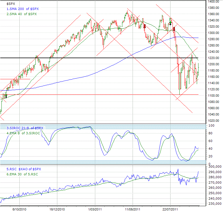
The daily SIROC is rising indicating a short term counter up trend against the medium and long term down trends that are in place. Following a 200+ point fall in just 10 days a consolidation in the S&P500 was expected. SPA3’s last exit (most recent red down arrow) was on 29th July at 1292.
The S40 (green moving average) is well below the S200 (blue MA) – this is one of the indicators of a long term downtrend. The other is the slope of the S200. The upward slanting channel enveloping the last month of price action can be used to track the direction of the S&P500 over the next few weeks. Note that there have been higher highs and higher lows which is the first requirement for this to turn into a medium term rising trend. A fall below this channel and below 1100 would further strengthen the bear.
1220 should prove to be a resistance level for the S&P500 (the black line above the price action). If the S&P500 can manage to rise strongly above 1220 this could prove to be quite bullish in the short to medium term.
The RSC chart (bottom) shows that the fall in August was steeper than the ALL-ORDS but since then the S&P500 has resumed outperforming the Australian bourse.
| Local Market Report | |||||
| Index | Close | % Change | Intelledgence Risk Status | Short Term Trend | Long Term Trend |
| All-Ords | 4090.4 | -4.05% | HIGH | Down | Down |
| Information Technology | 476.7 | -3.19% | HIGH | Down | Down |
| Consumer Discretionary | 1144.4 | -4.11% | HIGH | Down | Down |
| Materials | 11703.84 | -3.95% | HIGH | Down | Down |
| Energy | 12374 | -4.41% | HIGH | Down | Down |
| Property Trusts | 741.8 | -4.22% | HIGH | Down | Down |
| Financials | 3656.6 | -5.38% | HIGH | Down | Down |
| Consumer Staples | 7273 | -2.37% | HIGH | Down | Down |
| Health Care | 7082.8 | -6.56% | HIGH | Down | Down |
| Telecommunications | 1036.3 | -0.24% | LOW | Up | Up |
| Industrials | 3159.1 | -3.75% | HIGH | Down | Down |
| Utilities | 4327.6 | -0.93% | Neutral – HIGH | Down | Up |
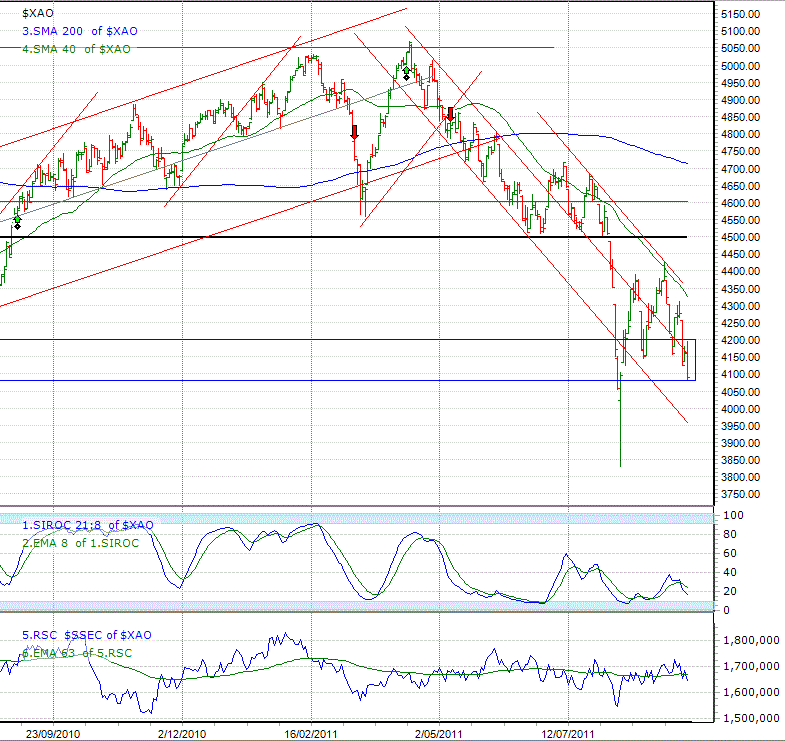
Just a quick glance at the the ALL ORDS chart compared to the S&P500 chart will make it obvious to the observer of the underperformance of the ASX. The RSC line in the S&P500 chart above proves this. The RSC line on the XAO chart (bottom graph) compares the ALL-ORDS to the Chinese Shanghai index (SSEC). This more accurately depicts where the ASX may be getting its lead from.
The blue rectangle in the chart below shows a major support zone for the ALL ORDS. It really does need to hold these levels otherwise the next fall could be to the 3840 – 3860 support zone and then to the 3630 – 3765 support zone.
The S40 is well below the S200 which is also slopiing down quite strongly. Keep and eye on the channel that envelopes the most recent ALL ORDS price action.
On the the upside, the ALL ORDS needs to rise above 4426 before any hope of a rising market can be considered.
The SPA3 public portfolios continue to outperform the market by a large margin. See the performance table below that shows the comparative compounded annual returns.
| Portfolio Summary | |||||||
| Portfolio | 31/08/2011 | 7/09/2011 | 14/09/2011 | Weekly Move % | Top Mover | % Gain | |
| Intelledgence | $416,053.54 | $408,339.58 | $402,661.18 | -1.39% | SBM | 7.73% | |
| SPA3 Portfolio | $426,477.86 | $428,829.47 | $427,358.85 | -0.34% | WHN | 24.07% | |
| SPA3 Hedge | $501,616.65 | $504,429.60 | $500,651.01 | -0.75% | LCY | 20.45% | |
| SPA3CFD | $55,468.72 | $55,295.60 | $54,813.49 | -0.87% | NWT | 41.67% | |
| Compounded Annual Return | ||||
| Portfolio | 1 Year | 3 Year | 5 Year | 10 Year |
| SPA3 Portfolio | -6.24% | 2.52% | 7.60% | 13.74% |
| SPA3 Hedge | -0.96% | 0.92% | 10.62% | 14.74% |
| SPA3 CFD | -1.61% | 19.50% | N/A | N/A |
| All-Ords | -12.39% | -6.20% | -4.05% | 3.01% |
| All-Ords Accum Index | -8.65% | -2.04% | 0.07% | 7.34% |
Share Wealth Systems provides more detail on all of the above items at our eUGMS. The eUGMs are monthly multimedia presentations available to Share Wealth Systems members only.
The figures used in this Active Investor are based on data prices as of: 14/09/2011


3 Responses
always look forward to your newsletters. Factual straight forward information and charting. Any chance of including the fib levels in the next edition?
Response to Comment by Darren:
Will do.
Regards
Gary
HMMM what ever happens I am ready but I really hope you are right about the bottom we all need some respite LOL
No sorry their is no wrong or right their just is ( think about it )