 |
From the Share Wealth Systems R&D Team |
_
Don’t forget to ‘Like’ us on Facebook – Click the ‘Like’ button on the right
“The Stats”
Welcome back to the conversation as we continue to delve deep into the heart of the systems research that my team and I conducted during 2011. Hopefully the past few posts have been helpful to you. If they have, and you’re excited about what you’ve read, then get ready, I’m now going to outline the statistical improvements.
This post will show the statistical outcomes from the recent SPA3 research and compare the previous SPA3 Edge prior to December 2011, to the SPA3 Revised Edge of December 2011. Whilst we are using our SPA3 medium term system as an example, these same principles can be used to any existing system or even a new system that one may be working on or evaluating.
The key to measuring statistical outcomes is to have a framework in place whereby using new concepts can be measured against the previous or a different system altogether. This requires a researcher to first seek guidance at the statistical level in order to measure quantitative changes to his / her system. In the case of SPA3, a system that has continually been researched for well over a decade, improvements can be measured clearly and easily because an existing framework and statistical benchmark is in place. This is one of the major benefits of using a mechanical approach to active investing.
The research begins with obtaining as much and as accurate data as possible. We used a fully maintained database of stocks including delisted stocks (stocks that were listed back in time that are no longer listed such as One-Tel, HIH Insurance, ABC Learning & Babcock and Brown) from 1990 onwards with the end date of the research period being the 18 May 2011.
The research was broken down into Raw Edge, annually by calendar year, by entry & exit signal, by trade volatility and others. Whilst in sample and out of sample research was conducted we have not gone into that detail in this blog. Also, all research done on SPA3 post 1998 is out of sample research. To keep it simple we will only provide the statistics at the highest level, that is, across all categories of trades. Specifically, only trades with liquidity > $50,000 per day and < 3 zero volume days were included in the results.
Remember that the two main measurements that we set out to improve were End of Trade Drawdown (ETD) and Win Rate as it was determined that an improvement in these two metrics would best indicate and lead to an improvement in variation of trade outcomes which would in turn lead to an improvement in SQN and then ultimately in performance, as measured when conducting equity curve analysis and in live trading.
The set of tables of statistics below measure what we call a ‘raw’ edge which can then be further improved by omitting categories of trades that have common characteristics that a trader should opt not to trade in live trading. In the case of SPA3 we use the concept of what we call Risk Tables to omit such trades. As a rule of thumb, the better the improvement at the ‘raw’ edge level the better it will be when Risk Tables are deployed.
End of Trade Drawdown Analysis – ‘Raw’ Edge
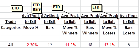
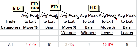
The table above shows the ETD pre December 2011 and the table below the SPA3 Revised Edge post the research and implementation of revised exit concepts.
These tables show the improvements for the average ETD (see previous posting in this series of blogs for an explanation of ETD):
• All trades: 37.4% improvement (12.3% down to 7.7%).
• Winning trades: 67.9% improvement.
• Losing trades: 17.6% improvement.
There is also a corresponding improvement in the number of trading days from peak to exit for all trades, winning trades and losing trades. In the case of the winning trades the ETD bars is down from 18 days to just 6 days! Such improvement will lead to a huge improvement in locking in profits and minimising volatility in a portfolio equity curve.
Overall Trade Analysis – ‘Raw’ Edge
While all statistics in the tables below are taken into consideration when analysing an edge, the metrics of Win Rate, Avg Profit, Avg Loss, Expectancy, Avg Loss/ Std Dev and SQN are seen as the important metrics. These are the Raw Edge results for the Pre December 2011 and Post December 2011 results, respectively.
The most important change is the fall in Avg Loss / Std Dev as this is a big clue as to how volatile a portfolio equity curve may be. There is a 30.7% improvement in this metric across all categories of trades. This improvement was achieved thanks to new exit signals and their ability to lock profits into the rising trend.
Win Rate: We saw a 6.4% improvement in the ‘raw’ edge Win Rate from the previous SPA3 to the Revised Edge.
Average Profit & Hold Period: The per trade profit decreased due to the newly introduced exit signals that helped lock profit into the trend. This comes with a decrease in the elapsed days hold period which will lead to higher potential compounding, albeit with a lower Avg Profit per trade. These two metrics should be viewed in conjunction with each other. Effectively the system has become slightly shorter term but still very much be a medium term trading methodology.
Expectancy: Expectancy tells you whether you have an edge or not. Contrary to common thinking, a higher Expectancy does not necessarily mean that you have a better edge. In theory, this should be the case but in reality as the Win Rate increases the Profit Ratio will decrease, and vice versa, which means that as the Win rate increases the Expectancy will decrease and move down along the Expectancy Curve shown in the previous blog posting. Therefore in this case, a higher Win Rate and falling Profit Ratio saw the Expectancy drop.
Average Loss/ Standard Deviation: As noted above this is an important improvement and one of the key metrics. This is an average across all categories of trades. As such there will be some categories that have very low variation well below 1.5. See the previous blog post for an explanation on this statistic.
SQN Number: This is an average across all categories of trades. As such there will be some categories that have very high SQN’s in excess of 2.5 and 3. See the previous blog post for an explanation on this statistic.
Overall Trade Analysis – Edge with Risk Tables
To complete this blog I should also include an example of the statistical edge after omitting some categories of trades that are mechanically determined by their volatility and raw edge metrics not meeting a certain minimum level of ‘edge’.
This table shows that, compared to the post December 2011 ‘raw’ edge, overall the Avg / Loss Std Dev has marginally risen but the Win Rate, SQN, Avg Loss and Expectancy have all shown fairly large improvements while still having plenty of opportunity to trade (parentheses state the improvement over the pre December 2011 ‘raw’ edge):
• Avg Loss ÷ Std Dev: -1.36% degradation (29.8%).
• SQN: 26.4% improvement (37.9%).
• Win Rate: 5.5% improvement (12.2%).
• Avg Loss: 9.7% improvement (22.5%).
• Expectancy: 28% improvement (-3.2%).
Over a large sample of trades these improvements make a big difference to a portfolio equity curve as we will demonstrate in more blogs to come in this series.


3 Responses
Hi Gary whilst I realize you are a very generous and benevolent man don’t tell em everything LOL
But don’t be so abhorrent to the elderly on Sky Business as you were the oter day !….Not a good look and deppreciated what you were trying to convey.
Response to Comment by Jay:
Rather than quote the supporting emails that I received regarding the Your Money Your Call show that you refer to, I’ll just let this one go through to the keeper.
Regards
Gary