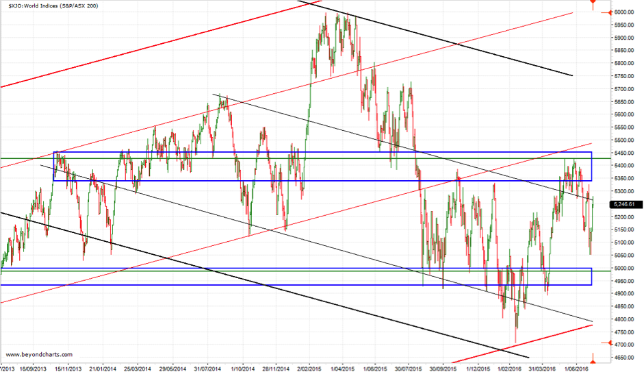
From early May to early June the ASX200 attempted to break through the resistance zone between 5335 and 5450 (the top blue rectangle). This proved to be too much for the ASX200 yet again, now making this resistance zone an even more significant zone. Meaning that it will become more and more difficult to break through but when it does the likelihood of remaining above this zone will be higher.
Since failing to break through a lower low, lower high and lower low have occurred; the second lower low being caused by Brexit last week. Since Brexit the ASX200 has rallied in sync with equities markets around the world but has not yet achieved a short-term higher high.
The trading sessions on Monday to Wednesday this week will determine whether the ASX200 completes another lower high or whether it tracks higher back into the resistance zone.
The down trending channel demarcated by the two outer down trending thick black trend lines continues to be the controlling pattern for the ASx200.
 Source: Beyond Charts
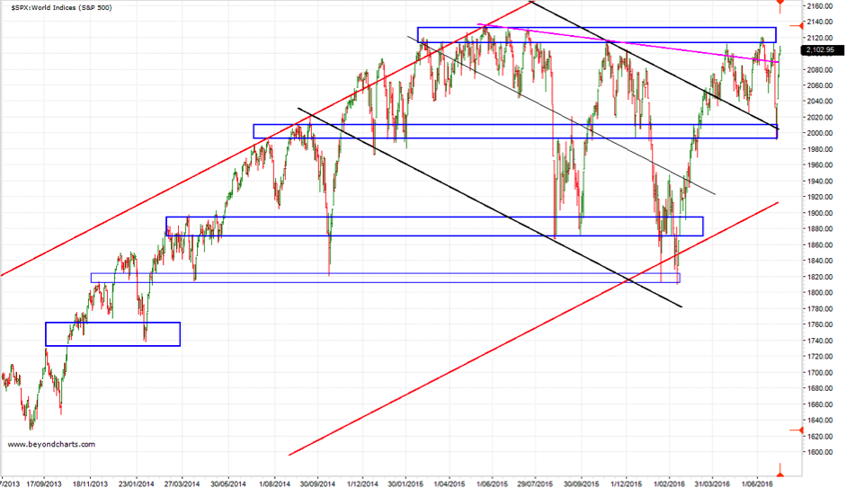
The chart for the S&P500 below covers exactly the same three-year period as the ASX200. The relative strength of the USA equities market compared to the ASX200 is obvious.
The most upper resistance zone is the all-time high for the S&P500. Expect another challenge of this high over the next week or two. Whether there is a breakthrough or not will determine whether the S&P500 begins another advance heading towards the 2320 to 2335 zone, or falls back to the support zone below to prepare for another attack on its all-time high.
The S&P500 has broken out of the down trending channel demarcated by the solid black trend lines indicating that the solid red rising channel is again the controlling channel pattern. A decline below the resistance zone below the current price and back into the down trending ‘black’ channel would indicate weakness and potentially further falls, potentially back to the lower red channel line.
 Source: Beyond Charts
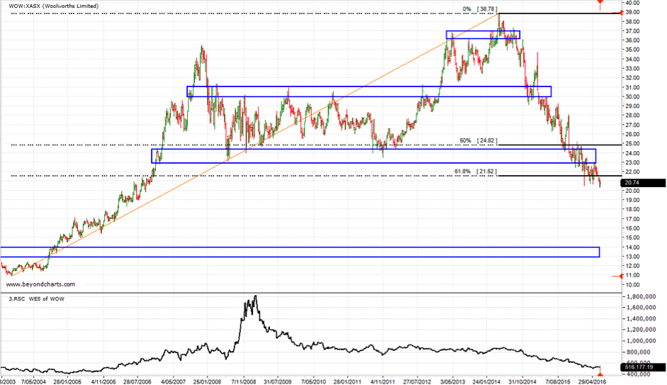
The next chart is a thirteen-year weekly chart of Woolworths (WOW). WOW’s share price fell below a key support zone between $23 and $24 (the 3rd from the top blue horizontal rectangle) in March this year. Not only has WOW failed to rise back into that now resistance zone, it has started to fall further. This fall has taken WOW below its 61.8% Fibonacci retracement level, another indication of further weakness.
All this adds up to WOW heading towards its next major support zone which is way down at the $13 to $14 level. There are two weak support zones around $19 and $17 both of which could see WOW rally a little from each of these levels. A reassessment should be done at each of these levels should WOW get there.
Of course, a break above the resistance zone in the near future would be bullish for WOW but this would appear to be a low probability outcome from its current weak price movement.
 Source: Beyond Charts
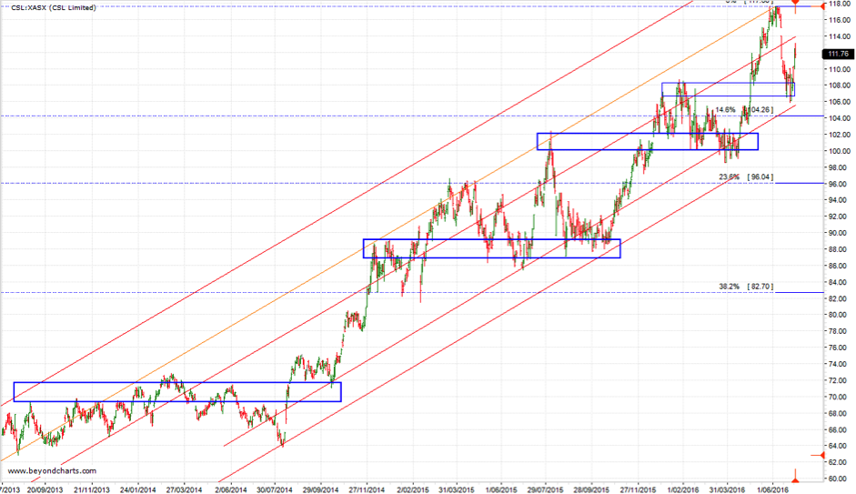
The next chart is a three-year daily chart of CSL Limited (CSL). CSL is showing ongoing indications of strength having retracements as it is share price advances higher. No share price (or index) rises or falls in a straight line. Simply put, CSL continues to be a hold.
 Source: Beyond Charts
Gary Stone is the Founder and Managing Director of Share Wealth Systems.
ASX200 relatively weak compared to the S&P500
From early May to early June the ASX200 attempted to break through the resistance zone between 5335 and 5450 (the top blue rectangle). This proved to be too much for the ASX200 yet again, now making this resistance zone an even more significant zone. Meaning that it will become more and more difficult to break through but when it does the likelihood of remaining above this zone will be higher.
Since failing to break through a lower low, lower high and lower low have occurred; the second lower low being caused by Brexit last week. Since Brexit the ASX200 has rallied in sync with equities markets around the world but has not yet achieved a short-term higher high.
The trading sessions on Monday to Wednesday this week will determine whether the ASX200 completes another lower high or whether it tracks higher back into the resistance zone.
The down trending channel demarcated by the two outer down trending thick black trend lines continues to be the controlling pattern for the ASx200.
The chart for the S&P500 below covers exactly the same three-year period as the ASX200. The relative strength of the USA equities market compared to the ASX200 is obvious.
The most upper resistance zone is the all-time high for the S&P500. Expect another challenge of this high over the next week or two. Whether there is a breakthrough or not will determine whether the S&P500 begins another advance heading towards the 2320 to 2335 zone, or falls back to the support zone below to prepare for another attack on its all-time high.
The S&P500 has broken out of the down trending channel demarcated by the solid black trend lines indicating that the solid red rising channel is again the controlling channel pattern. A decline below the resistance zone below the current price and back into the down trending ‘black’ channel would indicate weakness and potentially further falls, potentially back to the lower red channel line.
The next chart is a thirteen-year weekly chart of Woolworths (WOW). WOW’s share price fell below a key support zone between $23 and $24 (the 3rd from the top blue horizontal rectangle) in March this year. Not only has WOW failed to rise back into that now resistance zone, it has started to fall further. This fall has taken WOW below its 61.8% Fibonacci retracement level, another indication of further weakness.
All this adds up to WOW heading towards its next major support zone which is way down at the $13 to $14 level. There are two weak support zones around $19 and $17 both of which could see WOW rally a little from each of these levels. A reassessment should be done at each of these levels should WOW get there.
Of course, a break above the resistance zone in the near future would be bullish for WOW but this would appear to be a low probability outcome from its current weak price movement.
The next chart is a three-year daily chart of CSL Limited (CSL). CSL is showing ongoing indications of strength having retracements as it is share price advances higher. No share price (or index) rises or falls in a straight line. Simply put, CSL continues to be a hold.
Gary Stone is the Founder and Managing Director of Share Wealth Systems.
Related Posts
Swing Trading Strategies for Consistent Outcomes
You’ve probably heard about swing trading as a popular trading strategy for capitalising on short to medium-term market movements. Unlike
How to Use Trading Signals to Your Advantage (and Make Better Trading Decisions)
The world of trading is highly unpredictable and fast-paced. That’s why being the master of emotions is a rare skill