This week’s blog looks at our momentum ‘equities and cash’ strategy’s performance during rising and sideways markets. I have put this week’s posting together in response to a question by a reader of last week’s blog. His question is repeated here:
“Gary, is it possible to compare these strategies from a more recent common start date? Say 4/1/2009. Let’s face it, the biggest “gains” have been in periods where the active portfolios moved to cash to avoid a loss. A comparison of active momentum investing vs just holding the ASX200 over the past 3 years would be interesting. Murray”
I believe Murray’s question is two-fold:
- regarding the handling of more recent sideways and choppy markets, and then,
- whether SPA3 only makes handsome advances against the overall market index by being in cash during down periods or whether it outperforms during rising and / or sideways markets too.
To illustrate I have used the publicly traded portfolio which has been mechanically traded exactly according to the SPA3 rules over the years since 25th Jan 2001. I have used three different sideways and / or rising market periods to illustrate my points, the:
- most recent wide-ranging sideways period from 2009,
- rising bull market from Mar 2003 to Dec 2007, and
- narrow-ranging sideways market period from Nov 2001 to June 2002.
To determine the relative performance between the index and the SPA3 portfolio I have used a Base Reference chart that starts the portfolio and the All Ordinaries index at the same value at the beginning of each period, being the portfolio value.
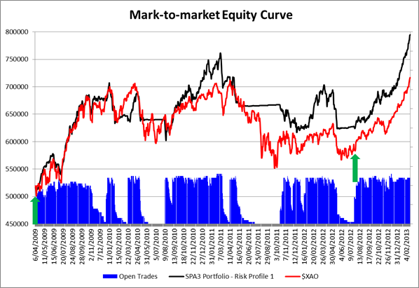
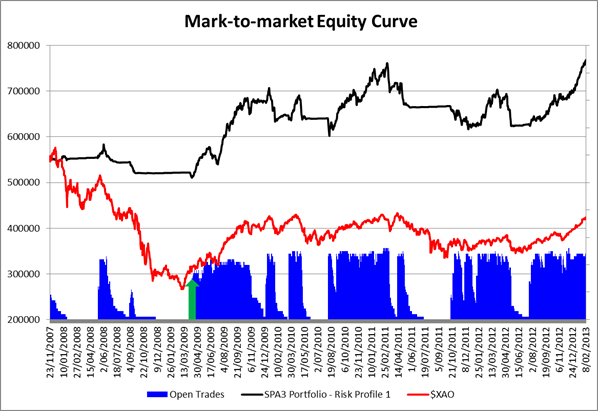
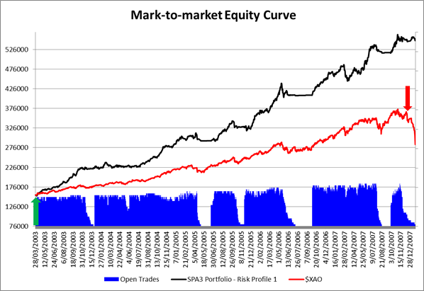
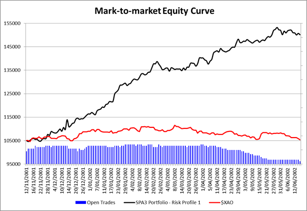
The SPA3 portfolio is the black equity curve line and the All Ordinaries index is the red line. In each of the charts I have also shown the open trades in blue. The gaps where the open trades fall to zero means that the portfolio is in cash. These periods coincide with a horizontal portfolio equity curve.
The first chart below covers the period from early April 2009, when SPA3 signalled that it was time to enter the market again after the 2008 GFC, to current. (The All Ordinaries has done 1.95% better than the ASX200 over this period). In my view this has been one of the most testing equities investment periods, passive or active, in many decades.
Whilst the first run-up from April 2009 to January 2010 was around 35% for both the portfolio and the All Ordinaries, in my view there were few investors that actually took advantage of this period as most were still shell shocked from the GFC falls of around 55% in world equity indices during 2008.
This is where the “call to action” from a mechanical system has one of its biggest benefits – mechanical active investors take action knowing, and trusting, that if a particular market entry signal doesn’t follow through then they will get an exit signal to go into cash thereby providing confidence to “pull the trigger” and engage. It’s liberating….
So, the picture below might show the portfolio only matching the index from April 2009 to January 2010, however, in reality, most investors that didn’t have a “call to action” were probably still in cash locking in the losses from the GFC having sold near or one the way to the bottom, and thereby NOT benefitting at all from this 8 month run-up.

The equities investing conditions since January 2010 have been awful on the ASX with sharp rises and sharp falls. However, SPA3 has outperformed the All Ordinaries by 10.9% (and the ASX200 by over 12%) due to its combined strengths of timing entry into the market and then getting onto the sidelines on occasions.
The rightmost green arrow in the chart above shows the market entry signal on 27 July 2012 to go from cash into the market. As is usually the case, such signals occur when investors least expect it. On this occasion I’m sure that most were caught again with their focus on being in cash and have once again missed the first juicy part of an equities market run-up.
This brings me to a very important point before answering the second part of Murray’s question. Risk management is a very necessary part of any strategy. In fact, in my view the whole caper of investing should be renamed to ‘risk management’.
The next chart shows the effect of starting the Base Reference relative comparison from 23 November 2007 when SPA3 provided a systematic risk signal to go into cash. Note the reduction of open positions immediately thereafter. During the GFC, this SPA3 strategy would have had a portfolio out of the market for 61 out of 71 weeks before the entry signal (green arrow) shown on the next chart below.

I understand the intention of Murray’s question above but risk management is an important part of the SPA3 strategy and should be for every investor’s chosen investing approach.
To illustrate SPA3’s ability to outperform during a rising market period I have zoomed in on the March 2003 to December 2007 period. Starting from the same relative base of $155,604, SPA3 outperformed the All Ordinaries over this period by nearly $200,000, or by double achieving 252% growth compared to the All Ordinaries rising by 125%.

Now let’s look at a sustained sideways market from December 2001 to June 2002 where the All Ordinaries ended at the same value that it started. The SPA3 portfolio grew by 43%.

It would be fair to say that every market period that might be termed ‘sideways’, ‘rising’ or ‘falling’ will be unique and therefore play out differently than any predecessor. However, all we can use is statistics and probabilities gleaned from using past data. And the higher the statistical probability of how a strategy handled different and varied conditions in the past, the higher the probability that it will handle them in a similar, not exact, fashion in the future.
Or put conversely, how confident would one be if a strategy handled the many and varied market conditions in the past poorly and consistently made losses?
Whilst some of the SPA3 “gains” have come from being in cash during down periods this is definitely not where all the gains have come from. Having said that, “gaining” from being in cash at times should be a very important part of any equities market strategy. And to achieve this and effect systematic risk market timing “call to action” signal is required that suits the investors timeframe and degree of activity for investing.
Now this is just a single equity curve that was traded according to specific rules documented in a Trading Plan.
To do the detailed research for, say, a detailed White Paper, we would need to run historical portfolio simulations of 1000, or more, portfolios each starting from the beginning of the sideways and rising periods used above, viz. 2/1/2009, 28/3/2003 and 12/11/2001 with different variables and determine how the many unique portfolios would have performed during these periods.
With the experience that I have in conducting such research, my view, from the above analysis and without actually conducting the research, is that in most rising and sideways markets most SPA3 portfolios would perform well above the index.
However, I believe I have answered your question sufficiently for a blog posting without doing such research right now.


4 Responses
The comparison from 2007 to now is the most appropriate
That time ( 2007) would undoubtedly be the time that most Aussies had their biggest investments in the stock market
Great work – keep it up
Hi Gary,
I am wondering what price is used in the theoretical portfolio?
Is is “Open” for the day or “Close”??
I am wondering how the results would change if the BUY price used the HIGH for the day (i.e. the worst buy price) and the SELL price used the LOW for the day (i.e. the worst selling price).
It is quite hard to buy/sell at the open/close price – it is important to also have a look at the “worst” case.
Thanks
Peter
Response to Comment by Peter:
The Close of the following trading day after a signal is used for all our research and theoretical portfolios.
Using the High for Buys and Low for Sells for EVERY single trade would be very unrealistic and far far more unrealistic than using the Close of the following day.
It would be far harder to Buy near the High and Sell near the Low for every Buy/Sell than do either near the Close. The ideal price for research would be to use the VWAP (Volume Weighted Avg Price) for the day after the signal but such data is not available in historical price databases.
However, I do get your your point that as unrealistic as it is, it would be nice to know what the worst boundary may be for the entry/exit price.
Regards
Gary
Hi Gary,
I seem to do quite well at buying at the highs and selling at the lows!
I guess the point of the exercise is to find out (by making a very small change in the code – instead of price.close just put price.low or price.high) what the band of low/high is.
If it is quite a tight band, then you just buy when it suits you.
If it really matters, then you would try to buy late in the afternoon, to get the closing price. However, it is also quite hard to buy at exactly the closing price, so knowing that it really does not matter helps the peace of mind.
Regards
Peter